
There is thus an evident need to pictorialize vast amounts of data, whether it is by drawing a line of best fit, compiling a pie chart, by adding more bars in a histograph, or by standardizing your observations to fit the normal bell curve. What is less explicit is trying to visualize data in new ways that respect the balance of functionality and aesthetics, and the ambiguous line between briefness and specificity.
To this end, more and more people are moving towards novel alternatives of presenting data. We are finding sophisticated tools that allow us to identify and study trends without only using Cartesian plots. There are several software packages available (many are free of cost) that are accessible to every level of stakeholder – whether you are a research associate fresh out of college, a tenured professor with a few government positions to his or her name, an expert on international development, or if you are just curious about data analysis. These software tools aim to move beyond the traditional 2-dimensional visualization techniques to bring us more in touch with a realistic portrayal of various issues.
In particular, international development and development impact are the perfect areas to use more data visualization techniques. We are well aware of the challenges that exist of using data to implement key policy-related decisions; this is true for every level – at both the grassroots level and at the bureaucratic government level. What a visual analysis of statistics can provide is a richer and more compelling interpretation of the data we have. It can also expand our understanding of the social context we are working in. New trends can suggest deeper issues to be grappled with, and widely-accepted trends can be synthesized in innovative ways to suggest diverse solutions.
There is no limit to the possibilities of enhancing research and policy through digital graphics. Depending on the purpose for which you are using the visualization and the type of data you are working with, there are a multitude of options available.
Infographics
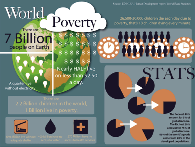
For example, informational infographics are now the norm when dealing with exploratory research and design. They are ideal when summarizing population statistics; they can dramatically depict the prevalence of illness in various countries; they can be stand-alone representations of survey results; they can also just be an interactive and appealing way of presenting preliminary research in the quest for grant money. Infographics tend to work well in a policy context for the nature of dissemination requests; they have to be quick, interesting, and easily digestible. It is also extremely convenient to modify them and make them dynamic for various audiences and purposes.
 |
| Source: UNICEF Human Development World Bank Statistics |
Figure 2 showcases the concept behind GapMinder.org, a popular example of 3-dimensional data. It allows you to choose among quite a few dimensions: choose a country, choose two or more of their available development indicators, and then decided what time frame you would like to see the trend in. It plays a short simulation through time of each country’s evolution with respect to the selected variables. It is fascinating because it conjoins numerous snapshots of data in different years into one portable animation. An initiative to promote the United Nations Millennium Development Goals, it “unveils the beauty of statistical time-series” graphs.
 |
| Source: GapMinder.org |
While these examples are perhaps pertinent to the dissemination of research and information, there are certainly other options that are suitable for research and academic consideration. For instance, there have been growing efforts to investigate social networks and other facets of behavioral economics. Social Network Analysis is essentially the mapping of relationships and flows between “entities”, including people, organizations, information centers, groups, etc. It uses nodes and links (pictured as central units or blocks) to understand the characteristics of these connections between the entities. You can actually “map” a social network of people to visualize certain dynamic qualities of that network. You can measure the density of a connection, the number of people connected to one other person, the degrees of separation, the potential critical nodes, the list goes on. You can of course do this without mapping it, but being able to map out these social network matrices allows you to “see” what is happening. You can then extrapolate by changing certain network features and seeing what happens to the entire structure.
 |
| Source: Social Networks, Dark Networks, and Les Misérables. http://godpoliticsbaseball.blogspot.in/ |
A final example of “mapping” that has been adopted lately is “geo-mapping” and geocoding. By referencing the geographical traits of a location or a point on a map, you can create relational data that can be used to visualize one cohesive dataset. Tools like AidData and ArcGIS can work in tandem with Google Earth to ascribe geographical coordinates to any location. You can then use any dataset (with GPS coordinates) in these applications. Data visualized in this way is relevant to everyone: researchers looking to find meaningful trends in their data, policy experts desiring a simple yet effective medium of conveying information, and government officials who are increasingly concerned with integrating a nation’s geography with pressing development themes. As we constantly amass a greater ability to harness satellite imagery and real-time civil infrastructure developments, we have a responsibility to use public portals and primary research along with these tools to validate development-related policies and findings.
Other Tools
These are just a handful of examples that demonstrate how useful and captivating data visualization can be. The internet is replete with various options for such visualization; TableauSoftware, a personal favourite, allows you to create spreadsheets, tables, and graphs to enthral even the most skilled data visualization expert. It stands to represent an ideal platform for creating interactive and engaging data compilations.
 |
| Source: Adam McCann. Tableau Public. |